Procurement software: budgets and approvals, from discovery to shipped
I designed the budgeting and approval tools in Sherpa Dental, procurement software for dental practices, and stayed with it through release, testing, training and demos.
- Outcome
- Shipped as designed in version 2.0, October 2024. I then trained the sales team and ran about 250 demos.
- My role
- The only designer: research, design from first options to release, acceptance testing, sales-team training and demos
- Team
- Built by two development agencies and an overseas developer on an existing Angular code base, with the client's product and operations teams
- Scope
- Field research, product design within fixed styles and components, acceptance testing, training
- When
- December 2023 to March 2025; live today
- Kind
- Product, shipped
The budget panel in three states
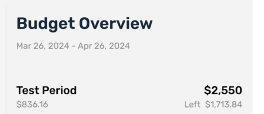
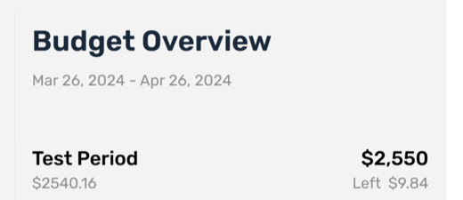
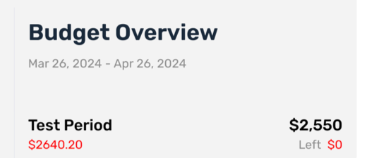
Budget figures in the images are mock data from the design file. No customer or business figures are shown, by agreement with the client.
The problem
A practice owner wants to control spending without approving every order by hand. Staff want to order what they need without waiting. Both have to trust the same number.
I did not start from a blank page. I walked into a half-finished brand, a loose grip on the problem and the users, and a platform with fixed styles and hard-coded components. The company was rebuilding its database, its order connections and its warehouse system at the same time, and nobody on the team had built software before.
What I did
- Field research first. I sat in on onboarding calls, account setups and product demos to learn how practices really buy, who they already work with, and what else lands on the same person's desk.
- Three budget designs, compared before anything was built. Each showed the budget within its limit, near the threshold and over it.
- Approval rules, then approval screens. Which orders pass on their own, which wait for a person, and what a manual approval looks like.
- Design inside the limits. The styling was fixed and much was hard-coded, so I set the type, color, spacing and button hierarchy the product could hold, and extended only what the developers could change without breaking something else.
- Acceptance testing each release with the development team, logging and sorting defects so the team fixed what mattered first.
Decisions
I showed the budget in three states before choosing one design. A budget that looks fine until it is suddenly over teaches people to ignore it. A week after the first comparison I revised two options and settled how over budget should look.
I wrote the rules before I drew the screens. Once the rules were on paper, each screen had one job: show the person waiting exactly where their order stands. The cost was time up front, before anyone had a screen to react to.
I designed within what was already built. A cleaner visual redesign was possible on paper and not in the code base. Every screen had to work with the styling and components that existed, so I spent my effort on hierarchy and wording.
What happened
The approval engine, budgets, reporting and alternative products shipped as designed in version 2.0 on October 11, 2024, with fixes and refinements since. Before that release I wrote and ran a five-session training series for the sales team. I have run about 250 product demos for single practices, buying groups and dental service organizations, and new accounts open with the practice's own purchase history already in them, through a quoting tool I helped build and set up.